Astryx v0.5.0: 30 locales, one Escape key, and bottom sheets in core
Everything since 0.4.0 in one release: a shared dismissal stack for overlays, a Banner API change with a codemod, 28 new locale catalogs, and theme inheritance that reaches the CSS.

Astryx v0.5.0 is out, gathering the eight releases since 0.4.0.
bash
Every stable
@astryxdesign/* package ships at the same version, so bump them all to 0.5.0 to match. The canary-only packages — lab, charts, richtext, vega — version on their own line.Two breaking changes
Preview the migration first:
bash
That is a dry run. Add
--apply to write the changes to disk.Banner's collapse axis is one collapsible prop
defaultIsExpanded is removed, and content can opt out of collapsing entirely — the case a banner most often wants (#5255). collapsible takes a boolean or a config, the convention SideNav.collapsible set:tsx
Default rendering is unchanged, and the codemod rewrites every call site that names the prop. It cannot see a spread — and neither can TypeScript, which does not excess-property-check one — so grep for
defaultIsExpanded after it runs and migrate <Banner {...props} /> by hand.One Escape dismisses one layer
Every overlay used to own its own Escape listener, so one press could close a Popover and the Dialog hosting it. Overlays now share a single dismissal stack that routes each press to the top-most layer and nothing else (#4881). A Tooltip inside a Dialog closes the tooltip.
Top-most comes from React-tree nesting, so it survives portals. A layer declares what it does with a press through
useLayerDismissal's escapeBehavior — close, or block for a required Dialog that has to swallow the press. Controlled layers, IME composition and browser-initiated dismissals like the Android back gesture all follow the same top-most rule.There is no codemod, because no prop moved. One thing to know if you listen for Escape yourself: the stack claims a press with
preventDefault() but leaves propagation alone, so a keydown listener on window now sees an Escape that a focus-trapped layer used to stop, with defaultPrevented already true.Also removed
The UMD bundle (
dist/astryx.umd.js, plus the unpkg and jsdelivr package fields) is gone. It bound to window.React, and React 19 ships no build that defines one, so there was no working configuration to migrate from; astryx template --cdn writes the import-map page that replaces it. Three abandoned page templates went too: table-page-chart, table-page-heatmap-status and table-page-shoe-store-heatmap.Three promotions
A promotion means a component is out of the experimental
lab package and into a package you can depend on. It always changes an import path, so it is the part of a release most likely to need your attention.Bottom Sheet → core (v0.4.4)
BottomSheet and BottomSheetSwitcher now come from @astryxdesign/core (#5080), and snapPoints makes the drag stops the host's choice — a viewport fraction (0.5), a percentage ('50%'), or a length ('320px'). A swipe that runs out of content keeps pulling and expands the sheet instead of stopping dead, a sheet resting at a detent re-resolves its geometry when the window resizes or the device rotates, and the mobile keyboard no longer shifts the page or moves the detents out from under the sheet.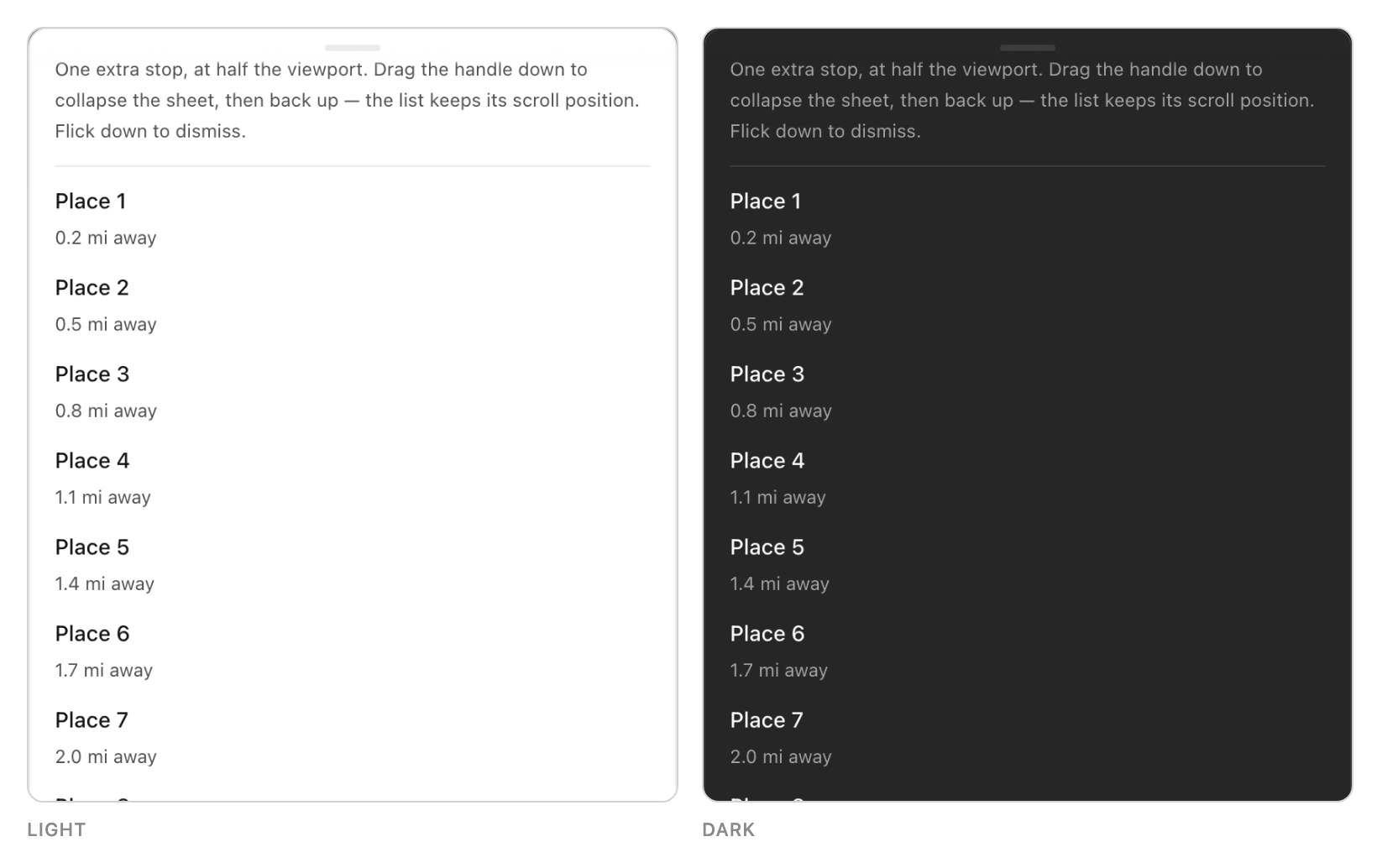
Stepper → core (this release)
Stepper and Step now come from @astryxdesign/core (#5201), with their horizontal and vertical layouts, separated and on-track indicators, semantic status, density and non-linear navigation. Advancing one step animates the connector — the accent fill grows out of the segment's leading edge, so moving forward reads as progress travelling the track. Going back, jumping several steps, mounting mid-flow and prefers-reduced-motion all apply at once.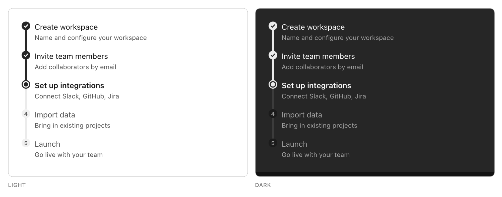
RichTextEditor → @astryxdesign/richtext (v0.4.1)
The Lexical-based editor moved out of
lab into its own package (#4678), so it can be canaried on its own. This one is not a stabilization — @astryxdesign/richtext publishes under @canary only, exactly as lab does. What changed for you is the import: RichTextEditor, RichTextView and RichTextEditorToolbar come from @astryxdesign/richtext now.
Highlights
30 locales, and dates that follow your provider
Core shipped with
en and fr-FR; it now carries 30 locale catalogs. DateInput, DateTimeInput, DateRangeInput and Calendar format and parse through the ambient InternationalizationProvider locale instead of the browser's, and Calendar weekday headers use CLDR stand-alone-short names. Live-region announcements in Selector, MultiSelector, Typeahead, FileInput, Tokenizer and Lightbox now come from the catalog with ICU plurals rather than an appended English "s". New useLocale and useCollator exports hand your own code the same locale for formatting and comparison.CJK input is safe as well.
Selector, MultiSelector, Typeahead, DateInput, DateTimeInput, TimeInput and NumberInput let an IME finish before reading a keydown as a command, so the Enter that commits a composition no longer commits the field with it — and the Escape that cancels one dismisses no layer.Themes now inherit from extends
A theme built with
extends used to emit only its own declarations, so every consumer of an inheritance chain got stock geometry with a new palette painted over it. The base now resolves into the child's output, and defineTheme throws on a bad extends instead of inheriting nothing.The focus ring is a token too —
--focus-outline-width, --focus-outline-style, --focus-outline-color and --focus-outline-offset drive every ring in core and lab, so one override restyles focus system-wide. And color.accent accepts a [light, dark] tuple, deriving a palette for each scheme.Keyboard, pointer and touch
TabList speaks the WAI-ARIA tabs pattern when you assert role="tablist", and a strip narrower than its tabs scrolls instead of spilling out of its container — every tab stays a tab, nothing hides behind a menu. ButtonGroup is a single tab stop with arrow-key movement between members. Breadcrumbs marks the current crumb with semibold weight rather than colour alone, which WCAG 1.4.1 requires and which the old tone-only treatment failed. Disabled elements across core and lab stop painting hover states and interactive cursors. On coarse pointers, the Slider track, sm checkboxes, radios and switches, and the shared clear button all meet the WCAG 2.5.8 AA 24×24 minimum — tappable area only; nothing visible moved.More to build with
FormLayouttakesdefaultOptionality, so a form marks only the exception.DateRangeInputtakesminRangeSpanandmaxRangeSpan.DateTimeInputtakestimeOptionIntervalfor a preset-time dropdown.MultiSelectorformats its whole trigger line throughformatValue.- A
Tableplugin can suppress a body cell's content. AspectRatioemitsratioas a class-level declaration, so it can be overridden per breakpoint.- PowerSearch browses up to 1,000 fields instead of 10, groups them by each field's
group, appliesmenuWidthto the field and search menus, and honoursmaxOperatorMenuItemsin value typeaheads. - The Markdown parser rejects
javascript:,vbscript:anddata:text/htmlURLs. Incremental parsing holds its settled blocks across an open code fence: over a streamed 500-paragraph response, blocks rebuilt went from 126,756 to 1,869.
CLI
astryx theme targets lists every component theming target — its defineTheme key, the class it paints, the props and states it accepts — with --json for lint and audit scripts. astryx theme template writes an annotated blank theme, and astryx theme build accepts any number of theme files in one process. astryx template --cdn writes a no-build-step page pinned to your installed version. Five new dashboard page templates join the template set. And an integration can contribute reference-doc topics that astryx docs serves and astryx search indexes.Thank you
Huge thanks to everyone who contributed across the eight releases since 0.4.0: @AKnassa, @andrskr, @arham766, @Astro-Han, @athz, @bhamodi, @cixzhang, @ejhammond, @Eloitor, @ernestt, @freddymeta, @Geervan, @gonzoblasco, @Han5991, @HelloOjasMutreja, @imdreamrunner, @is-jain, @jiunshinn, @josephfarina, @kentonquatman, @Kevinjohn, @lexs, @nynexman4464, @potatowagon, @rubyycheung, @Sunil56224972, and @Unmesh100.
Particular thanks to @Sunil56224972 for the Markdown security report and fix (#4330).
The full changelog is on the v0.5.0 release page.
ReleaseAccessibilityInternationalization